Pure Gymnastics - Brand Refresh & Expansion
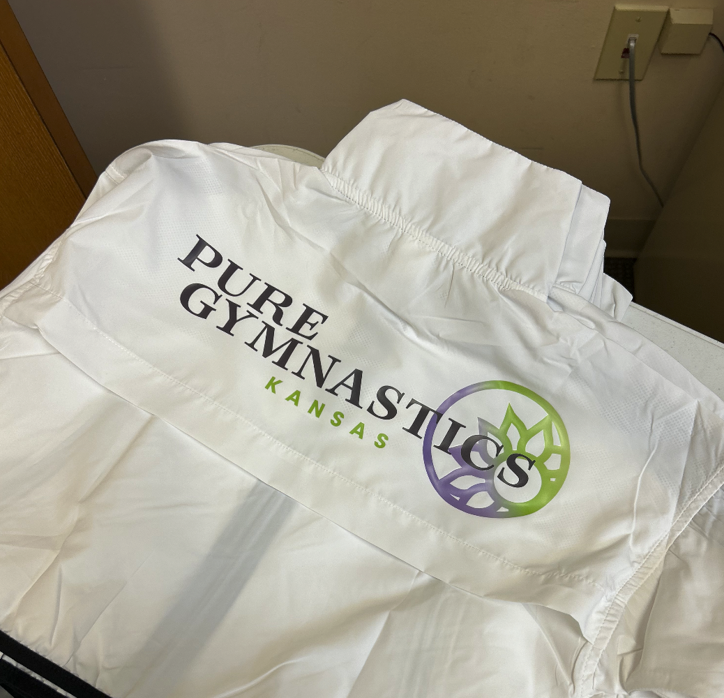
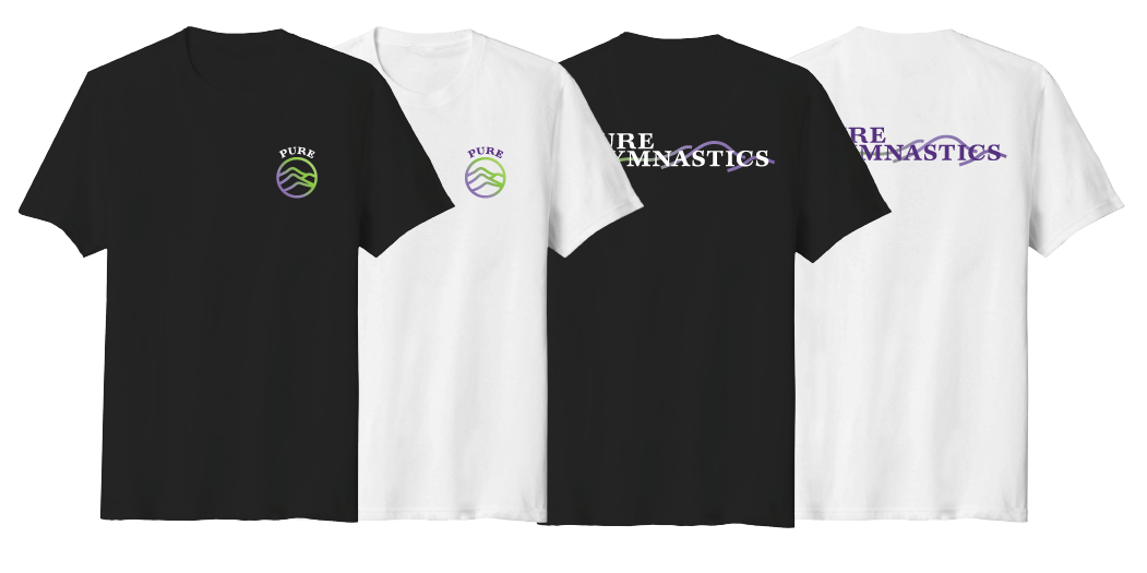
Pure Gymnastics was one of the first logos I ever created. I was only in high school when I designed it drawing with chalk on mats at gymnastics practice. Needless to say, after over a decade, the logo was in need of an update! I decided to breathe some life into the ideas from the original logo, updating the font, colors, and mountain shapes. This helps the logo fit in with the times while maintaining the recognition already created. Pure Gymnastics also expanded a second branch in Kansas. This logo follows the same brand but emphasizes the state of the sunflower. The websites are in process of being redesigned to match the new overall look.

BEFORE


AFTER


