Logo Refresh: DRIHS Case Study
Dr. Richard Izquierdo Health & Science Charter School in Bronx, NY, is a public and free charter school providing education to kids where upon graduation, they are certified EMTs. This school came to me looking to breathe some life into their existing logo, while maintaining the core elements and looking fresh. Below is a summary of how the new logo came to be. See the brand at work on the website here.

BEFORE

AFTER
Let’s take a look at how we got to the final refreshed logo
ONE: Capturing client goals
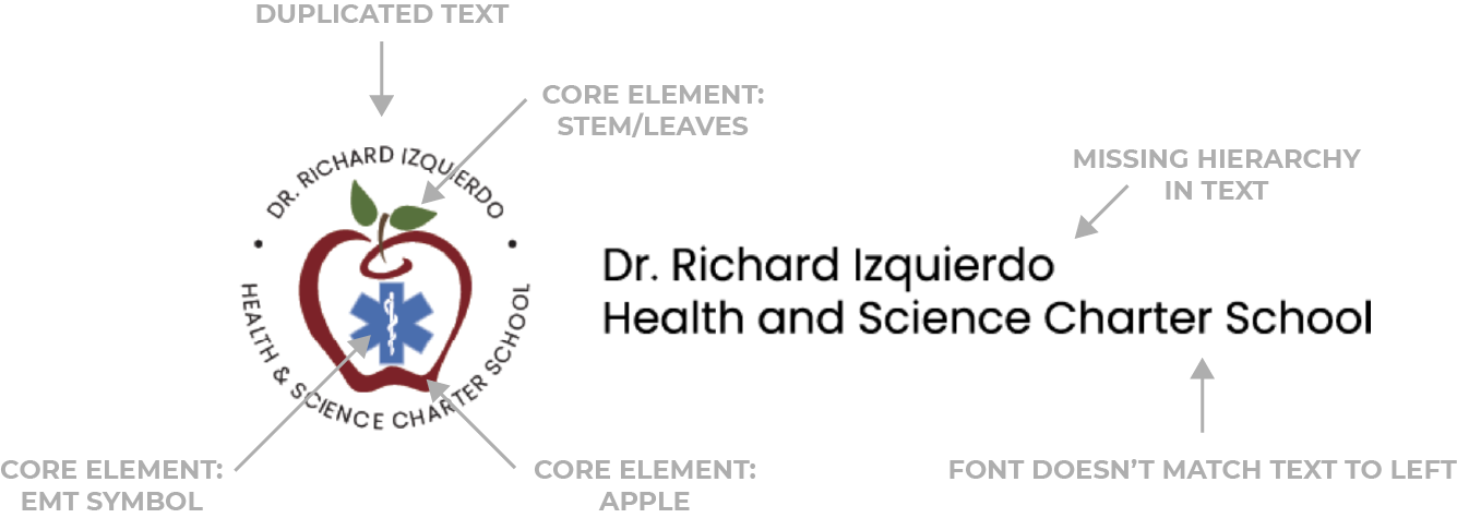
Upon starting the project, I made sure to align with what the client had in mind. The goal was to modernize the current logo without losing its essence and to play with the colors but not make them completely different, while being creative with the current elements. Analysis of the original logo began.
TWO: Ideation phase
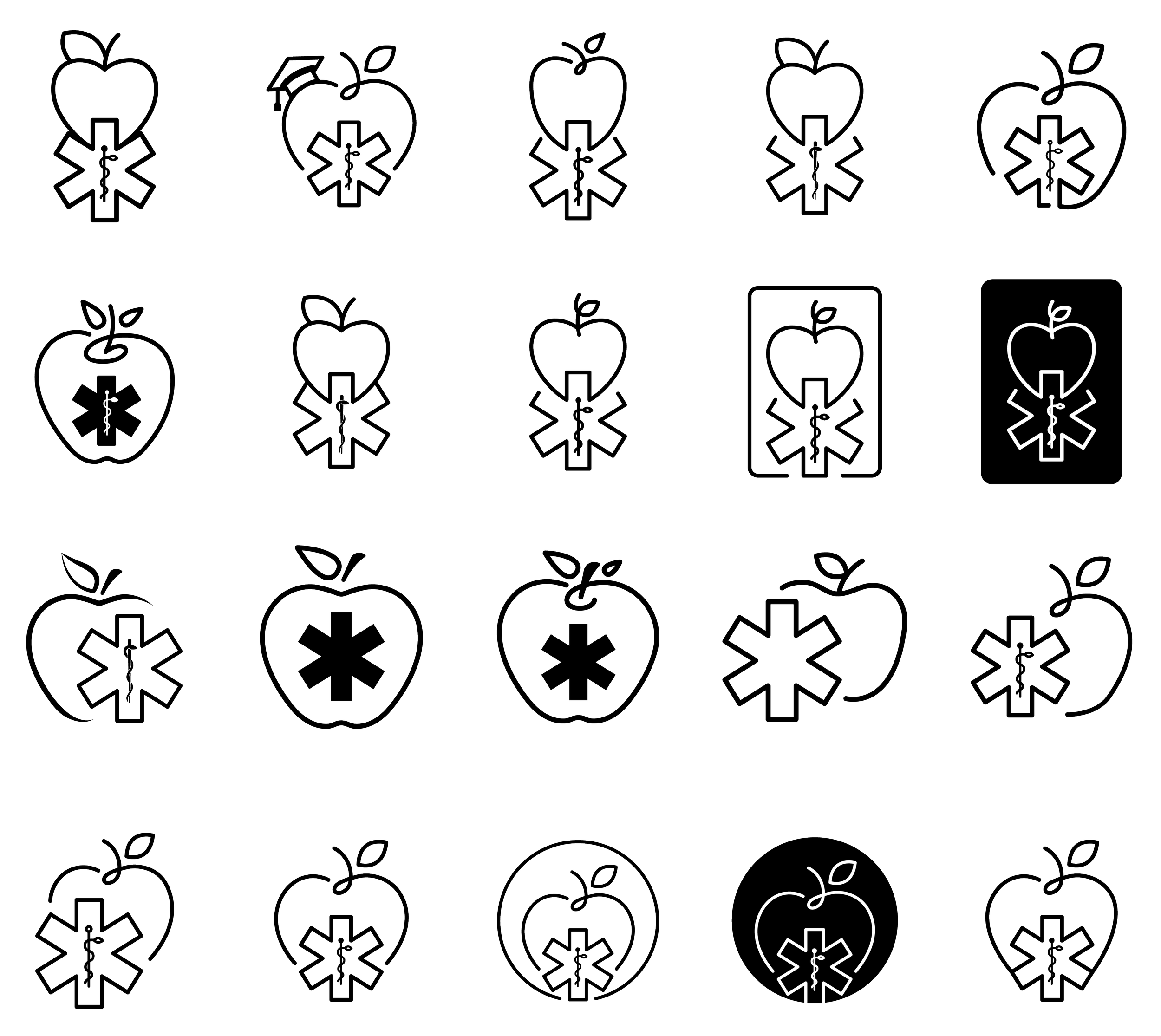
With the client goal in mind, I got to the drawing board (the Ipad). I created sketches and black and white vector design mockups for the icon to help me visualize all the directions we could take this logo.
THREE: Addition of colors and fonts
After looking at the black and white icons, I started adding different fonts and variations on the original colors to create some logo options.
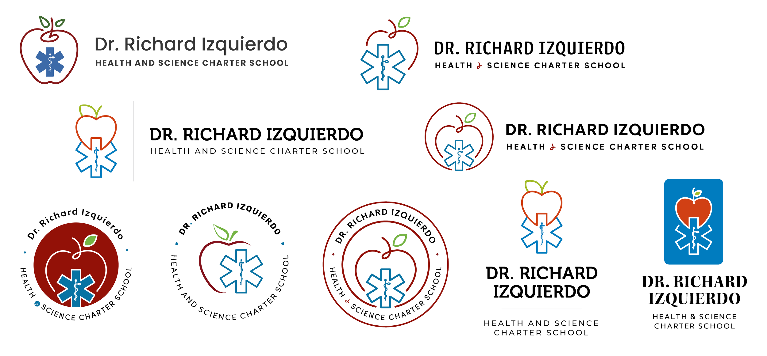
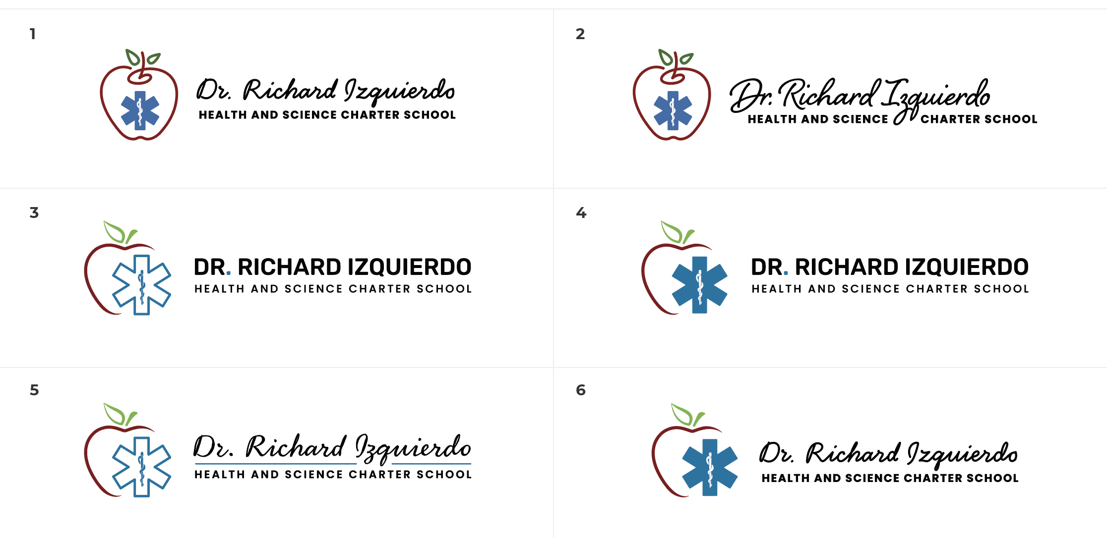
FOUR: Implementing client feedback
Some fine tuning and playing on the chosen options created another set of logo options.
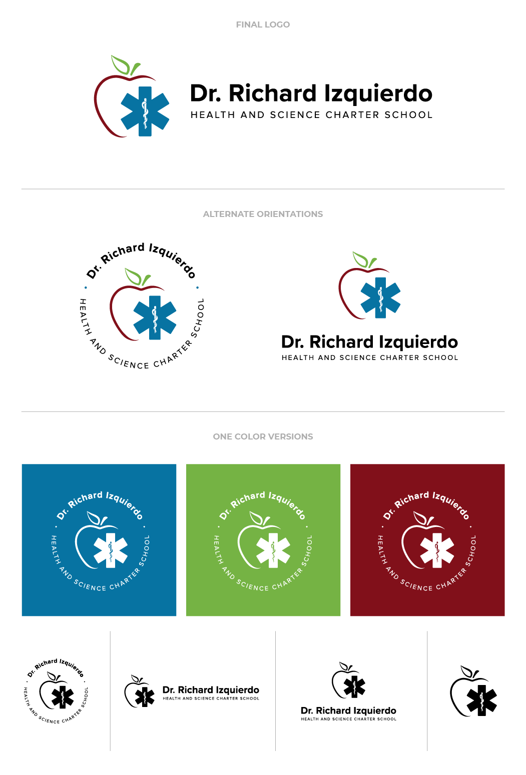
FIVE: Finalizing the logo and adding various orientations
After a few more tweaks, the logo was complete, in 3 orientations for any use case! The final logo ended up using the original red, with some adjustments on the other colors and it still holds the EMT symbol and the apple, built together in a creative, modern way.
